We've published two new charts to help you analyse the way cat bond offerings price or change in size over the course of issuance
Charts: Cat bond offering price and size changes | | | New charts: Catastrophe bond offering price and size changes during issuance 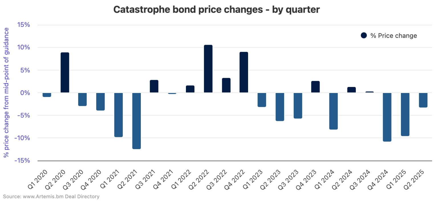 Among the data points we track during the timeline of each catastrophe bond issuance, are the movements in pricing between the mid-point of initial offering guidance and the finalised spread, as well as any changes in the size of a cat bond offering from the initially targeted amount. Among the data points we track during the timeline of each catastrophe bond issuance, are the movements in pricing between the mid-point of initial offering guidance and the finalised spread, as well as any changes in the size of a cat bond offering from the initially targeted amount. We've created two new charts to help you analyse these two catastrophe bond market data points, averaged across issuance by quarter, which can help in visualising cat bond offering execution over time, investor demand related factors, as well as providing signals for overall market conditions. Find these and many other interactive charts and visualisations in our redesigned page listing all of our catastrophe bond market charts. Read the full story. Other articles: | | | | | | Please share this with colleagues and friends if you think they would like to receive it.
If you've been forwarded this but want to subscribe, visit Artemis.
| | | | | | You may be receiving this because you recently attended an industry event we partnered with, giving us permission to email you. If you don't want to receive our weekly ILS, catastrophe bond and reinsurance capital newsletter please Unsubscribe or Edit your subscription here .
© Steve Evans Ltd. - Artemis.bm
| | | |


No comments:
Post a Comment